

User-focused wayfinding that actually works
Designing signage starts with a person standing in a space, not a blank wall. That user-centric view drives every choice: scale, sightline, wording, and placement. When stores and public spaces deploy thoughtful retail signage, customers move more confidently, staff interruptions drop, and queues form less chaotically. This article walks through practical design moves that minimize pedestrian confusion and explains how custom-molded signage translates ergonomic intent into real-world clarity.
Common friction points that derail pedestrian flow
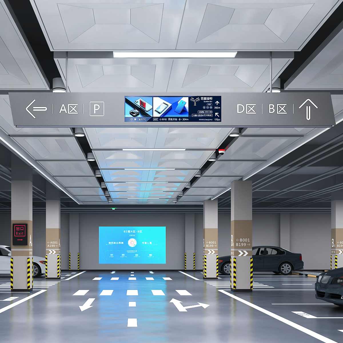
Confusion usually comes from mixed signals: competing visual elements, small type at odd angles, and signs placed where people don’t naturally look. Wayfinding suffers when visual hierarchy is weak or when signs ignore typical sightlines near entrances and decision points. Fixing those things is less about flashy tech and more about consistent patterns — predictable placement, bold directional cues, and easily scannable copy. Think of every sign as a coach: short, assertive, and visible from the right approach.
Design rules that prioritize real people
Start with measurable constraints: average sight distance, pedestrian speed, and common decision points. Use high-contrast colors and large glyphs so signs read at a glance. Include tactile cues and ADA compliance for accessibility; those choices help everyone navigate faster. Durable substrates and anti-glare finishes keep signs readable under heavy use. Keep language concise and use iconography tied to common behaviors — arrows that align with walking lanes, not just building plans.
Lessons from a large-scale real-world anchor
Consider the pedestrianization of Times Square in New York City: when planners added clear walking zones and strategic signage, pedestrian crossings became safer and movement patterns steadied. City transportation departments reported measurable improvements in flow and reduced conflicts after redesigning decision points. That example shows how wayfinding plus physical layout changes reinforce each other — signage alone helps, but signage aligned with the environment solves problems faster.
Implementation tips and common mistakes to avoid
Many projects trip over three recurring errors: treating signage as an afterthought, using inconsistent materials, and crowding signs with too much text. Start signage design early alongside fixture and flooring plans. Prototype sign heights and sightlines with simple mockups before final production. Test at peak times — staff and actual customers will reveal unexpected occlusions. Small iterative trials cut risk and save budget.
Also remember — digital displays can help with dynamic info, but they must follow the same visual hierarchy as static signs. When screens flash competing colors, the brain hesitates. Balance digital updates with stable directional cues.
Golden rules for evaluating custom signage options
Use these three metrics to choose the right solutions:

1) Sightline Efficiency — Measure how far a sign is legible from typical approach angles and speeds. Longer readable distance equals fewer hesitation points. Include mounting height and angle in evaluations.
2) Consistency Index — Check materials, typography, and icon sets across the site. A single visual system reduces cognitive load and speeds decisions. This includes matching finishes so signs read as a family.
3) Durability vs. Flexibility — Balance durable substrates and finishes for long-term wayfinding with modular elements where seasonal or operational changes occur. Modular designs save cost and preserve clarity when layouts shift.
Closing perspective and where Cosun Sign fits
When teams put people first, signage becomes the invisible guide that keeps spaces moving. Effective wayfinding reduces staff interruptions, shortens dwell times at problem spots, and improves the customer experience. For tailored options that combine ergonomic thinking with quality production, custom retail signage solutions offer end-to-end support — from prototype to installation. That practical value is why experienced planners reference trusted manufacturers.
Cosun Sign brings that blend of user-centered design and manufacturing reliability to real projects — a partner that understands sightlines, materials, and local accessibility standards. — Clear signage, confident movement.